|
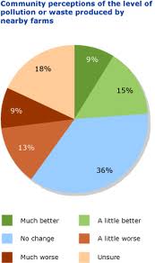
This graph is telling you if the act
of littering has improved or not. Darck Green=9% Light Green=15% Orange=13% Blue=36% Skin Colour=18% Red=9% |
|
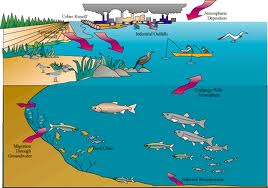
This chart is describing the pollution
in the sea. |
|
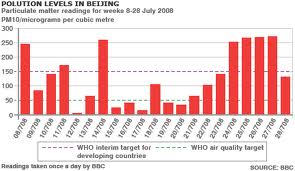
This colum graph is on the
pollution levels in Bejing. |
|
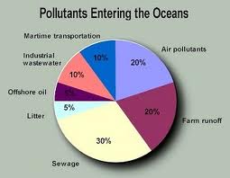
This pie graph is showing how
much of diffent types of pollution is entering the oceans. Air pollution=20% Martime Transportation=10% Industrial wastewater=10% Off shore oil=5% Litter=5% Sewage=30% Farm runoff=20% |
|
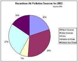
This pie graph is about the
hazardous air pollution sources for 2002. Major sources=20% Area sources=30% Fines=7% Mobile on road=27% Mobile non road=16% |
By clicking on a picture it will resize and become bigger.
